Skip to content

Charts

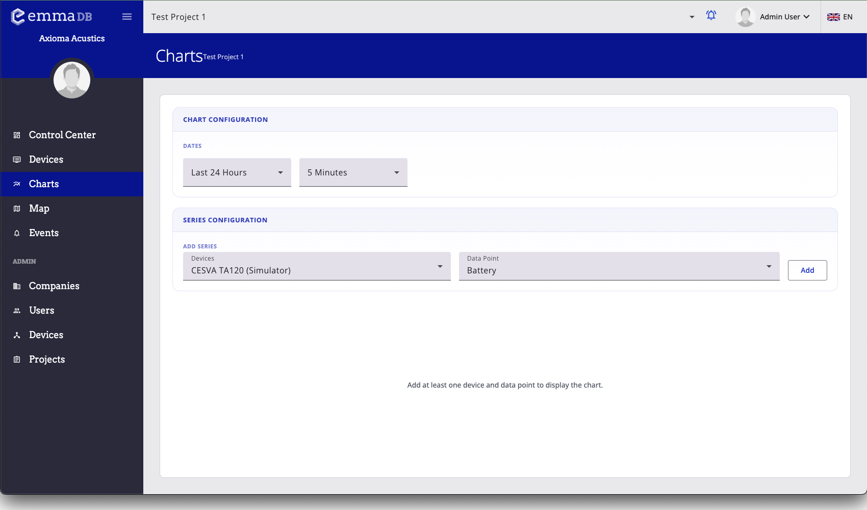
The charts module is meant for analytical work across time ranges, data types, devices, and project context.

On this screen

Charts screenshot
  1. Choose the date range and time bucket.
  2. Select the device and metric you want to display.
  3. Add the series to build the chart view.

What you can do here

  • Compare values across time using the filters at the top of the page.
  • Use charts when you want analysis across a broader time range than the dashboard provides.
  • For a single device workflow, start from the device Data tab.